Back in the days of classic Excel (versions 97 through 2003), I displayed about 10 toolbars, working out to hundreds of commands represented by tiny icons. We recognized them, and were able to have all of our most used commands one click away.
Then came 2007 which gave us the Ribbon in its place. The Ribbon consumed as much real estate as three rows of toolbars, and gave us a lot less commands one click away. The story we heard was how Microsoft was trying to make the experience easier for new users… making commands more discoverable. The revised system was supposedly more logical than all the commands buried under menus in the old structure.
To some extent, I'd agree that Microsoft accomplished their goals here. The applications are much less intimidating than they were for new/less experienced users. The issue is that it smacked the power users pretty badly. I still feel that I'm less efficient with the Ribbon than I was with the toolbar hierarchy, and I've written the book on how to customize the user interface. The only reason I got into ribbon customization in the first place was to try and get some of that efficiency back that we lost under the new paradigm.
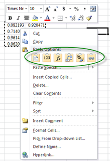
Interestingly, as we can see with the copy/paste icons in Office 2010, Microsoft is starting to move toward and icon basis again, without as much text:
I wonder if this is to make it easier to port the application to other languages? I also wonder how long it will be before we start seeing a Ribbon with no text on it at all? After all, it just wastes space when you know what the commands do.
Now, here's where I get confused… I installed Internet Explorer 9. And here's the basic install:
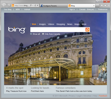
This is discoverability? I'm not saying I want a full blown Ribbon here, but you can't tell me that these two philosophies are the same? The menus are gone, granted that's consistent, but where are the favourites that I used to be able to have one click away? I actually had to download a toolbar for it. In fact, I've found the lack of discoverability of controls to be so frustrating that I went and installed Firefox. Unfortunately this seems to be the new thing.
I don't get the completely opposite directions here. In one app we're putting in big, bloated user interfaces to be in the users faces. In the other we're trying to remove it all and make them hunt for it. What gives?
7 thoughts on “I’m confused”
It's funny--I didn't start using Excel until this past year, so the ribbon is all I know. I like the fluid, tabbed aspect of it (online, I'm a tabbed>windows girl), and didn't mind that it took me a few weeks to figure out what commands lay under which tab. However, I'm the furthest thing from a power user, and I know that a bunch of our dev guys were initially very frustrated by it.
Oh, and I loathe, loathe loathe the lack of toolbar in IE9. It makes absolutely no sense to hide it!
If you right-click on the header, you can check-mark the toolbars you want to show. So the toolbars still exist, but they didn't tell anyone how to access them. Very Sad.
Now that I have my toolbars back I kind of like IE9, except now it keeps blocking all the so-called unsecure content every time my browser refreshes. Annoying!! Haven't figured out how to stop that yet? I know that I can probably fix it with Internet Options, but our IT dept. doesn't give us complete access to all the Options tabs. Double Annoying!!!!!
I use both Excel 2010 and 2002.
I still like Excel 2002 because it's so much quicker - both to start up and with all the right buttons just one click away.
But certain things - like the chart formatting - feels easier with the ribbons.
I don't think Microsoft is done experimenting - to get best from both worlds.
Hi Ken,
I totally agree.
I get the lack of toolbars in IE, their copying chrome, which is very hard to use, "as a browser" but makes the things you do most, easier/easiest. I think there are saying, web apps - lets make the best container for them that we can, that means giving up as much screen as possible.
The ribbon is just a pile of steaming crap! - There's no way I believe that it's better (or worst) for new users - when your new, its always hard. It does look nicer. It is much more work to get things done.
I will be interested to see if/when it gets put into Visual Studio?!
I was entertaining the thought of downloading IE9 (due to a recent computer rebuild I am back at IE7 for the nonce).
After reading this post, I'm thinking maybe not...
🙂
Maybe it's because Excel is considered for 'building' something and IE is for 'viewing'? Not that I'm trying to defend MS or anything.
At first I had a hard time getting used to the Ribbon but now I've loaded up the QAT with the most used commands from left to right with the Ribbon collapsed. By doing so and with the new features in 2007/2010 I'd say I'm problably more or just as productive as with 2003.
I've switched back to Office 2003. I think my next step will be Open Office. At least then I'm not paying to be abused. The simplest tasks now take minutes to complete in Office 2010 instead of the split second in 2003. As for Explorer. OMG it's so "user frigging friendly" it's unusable. I don't want my computer to be an iphone. A computer is for work. iphone is a toy. Wake up Microsoft.