Now I know that not everyone is going to want to do this, but one of the things that I find which really helps me understand complex calculations or visuals, is to manually replicate the values used. It helps me understand the methods, exact values plotted and allows me to really validate the output. So just for fun, let’s build a quick Box and Whisker chart, then prove out the values that have been plotted.
Creating the Box and Whisker chart
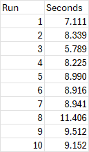
For this post, we are going to create a simple Box and Whisker chart using the defaults that Microsoft provides. (Keep in mind that you can, of course, customize the values displayed, which may change the calculations used below.) The data set we’ll use is a short one, containing 10 observations representing Power Query refresh times:
Creating the chart is fairly straight forward:
- Select the data and press CTRL + T to turn it into an official Excel table
- Go to the Table Design tab and – on the left side – change the name of the table to “Data”
- Selected the entire “Seconds” column
- Go to Insert -> Recommended Chart -> All Charts -> Box & Whisker -> OK
- Change the Chart title to “Query Refresh Times (seconds)
- Right click the blue fill and change it to a lighter blue (so you can see the values)
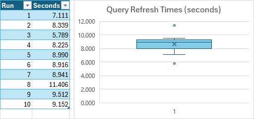
After making these changes, your readable box plot should look like this:
Proving the Box & Whisker Chart Calculations
We will now generate each of the Box & Whisker chart values which get plotted in the chart:
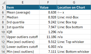
I started calculating these values in F6, so have provided the appropriate cell references before the formula during the calculations below:
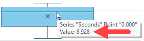
MEAN (represented by the x on the chart)
The chart's Mean calculation as displayed on the Box & Whisker chart is calculated using Excel’s AVERAGE function as follows:
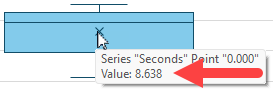
F6: =AVERAGE(Data[Seconds])The result is 8.638, which you can verify by carefully mousing over the x on the chart:
MEDIAN (represented by the line inside the chart box)
For this, we’ll use Excel’s MEDIAN function:
F7: =MEDIAN(Data[Seconds])The result is 8.941 which also matches the chart value shown when you mouse over the median line:
NOTE: To verify your Median value, sort all the values into ascending order. If you have an odd number of observations, the Median will be the middle occurrence of the data set. If you have an even number of observations, it will be the average of the middle two values.
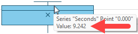
3rd Quartile (the top line of the box)
By default, Excel generates the quartiles for the Box & Whisker chart using the “Exclusive” method of the calculations. While you can change this in the chart properties to use Inclusive calculations, the formula to generate Excel’s default calculation is as follows:
F8: =QUARTILE.EXC(Data[Seconds],3)The resulting value of 9.242 can be matched up to the chart when mousing onto the top line of the box:
NOTE: If you customized your Box & Whisker chart to use Inclusive quartiles, you would need to use the QUARTILE.INC() function instead of QUARTILE.EXC() for this data point.
Why Choose Inclusive Quartiles? The difference between using Inclusive and Exclusive quartiles is essentially that Inclusive calculations (generated via the QUARTILE.INC() function) result in a narrower interquartile range with more outliers.
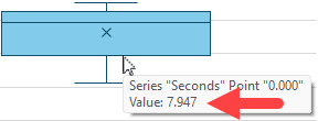
1st Quartile (the bottom line of the box)
Like the 3rd quartile, we use the QUARTILE.EXC() function to generate this value. The only difference is that we request quartile 1 instead of 3:
F9: =QUARTILE.EXC(Data[Seconds],1)This time, mousing over the bottom line of the box will show a value of 7.947, matching the result of the formula:
NOTE: If you customized your Box & Whisker chart to use Inclusive quartiles, you would need to use the QUARTILE.INC() function instead of QUARTILE.EXC() for this data point.
Interquartile Range (not shown on the chart)
While the interquartile range is not shown on the chart itself, I also find it helpful to calculate this as a helper formula, as we’ll need the output for a few different subsequent formulae. The calculation is a fairly straightforward difference:
F10: =3rd Quartile – 1st Quartile
F10: =F8–F9
This should return a value of 1.296 (9.242-7.947).
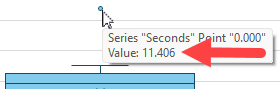
Upper Outliers Cutoff (not shown on chart)
We need to calculate this value to determine two things:
- Which values are outliers
- The value of the “maximum”, as this value should be the maximum value excluding the outliers
F11: =3rd Quartile + 1.5 x Interquartile Range
F11: =F8+1.5*F10
Again, you won’t see this value on the chart, but if you check the value of our plotted outlier, you’ll see that it is 11.406. This value exceeds our calculated cutoff of 11.186, which is why it gets plotted as an outlier dot above the box.
Again, you won’t see this value on the chart, but if you check the value of our plotted outlier, you’ll see that it is 11.406. This value exceeds our calculated cutoff of 11.186, which is why it gets plotted as an outlier dot above the box.
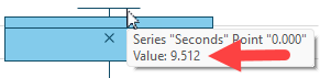
Maximum (the top whisker line)
The trick here is that the Maximum line plots the maximum value excluding outliers. In order to calculate this, we need to use a MAXIFS() function to exclude any value greater than our outlier cutoff line. The formula to do so is:
F12: =MAXIFS(max_range,criteria_range,"<" & Upper Outlier Cutoff)
F12: =MAXIFS(Data[Seconds],Data[Seconds],"<"&F11)
The trick with this formula is really in the final parameter where we have to combine the textual "<" character with the value we are looking for. This formula returns the value of 9.512 which appears when we mouse over the top whisker line:
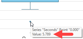
Lower Outliers Cutoff (not shown on chart)
Like the upper outliers, this Box & Whisker chart calculation is not shown on the chart, but required for plotting outliers and calculating the Minimum value. The formula for the Lower Outlier cutoff is:
F13: =1st Quartile - 1.5 x Interquartile Range
F13: =F9-1.5*F10
This formula returns a value of 6.003. If we check the chart, we do see an outlier dot plotted and – as expected, the value of 5.789 is below our 6.003 cutoff:
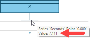
Minimum (the bottom whisker line)
The final value we need to verify is the Minimum value, which is used to draw the bottom whisker line on the chart. Like our Maximum, the Minimum value used for the Whisker line need to ignore outliers. This is calculated quite similarly to the Maximum, but uses the MINIFS() function instead:
F14: =MINIFS(max_range,criteria_range,">"&Lower Outlier Cutoff)
F14: =MINIFS(Data[Seconds],Data[Seconds],">"&F13)
The value returned by the formula is 7.111 which matches the value shown on the chart exactly.
Conclusion
As I mentioned at the outset of this article, I don’t really expect everyone to do this, but I find it useful to truly understand and prove where the values are all coming from. Hopefully this has helped provide you with some confidence as well. And now that you’ve validated the values displayed on your Box & Whisker chart, do you know how to interpret it? If not, have a read of this article which walks through how to read and draw conclusions from the results.
2 thoughts on “Proving Excel’s Box and Whisker Chart Calculations”
Your MINIFS function should be
">"&Lower Outlier Cutoff
(not less than).
Ah, quite right. Thanks Jon, I've updated the article. 🙂