Introduction
I’m a big fan of Excel's Box and Whisker chart (also known as Box plots to those in the statistics world). While they can be used in a variety of applications, my personal use case is to try and understand the performance of Power Query refresh times – something that my Monkey Tools add-in can do for you. Unfortunately, a lot of people don’t really understand the chart, so the purpose of this article is to dive in, explain how they work, and what conclusions you can draw from the data.
What do the Boxes, Whiskers and Dots All Mean?
The image below provides a quick summary of what each piece of Excel’s Box and Whisker chart represents.
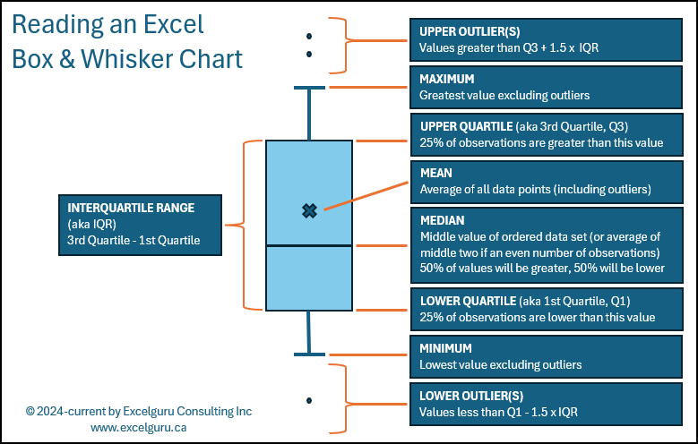
NOTE: For all the information that IS displayed on this chart, there is one value – which I believe is important – that is not present. That value is the number of observations used to generate the chart. I personally include this in the chart title so that the reader can determine if the sample size is sufficient to be able to draw any conclusions about the data.
You may wonder at this point why I keep referring specifically to this as an “Excel” Box and Whisker Chart. There are two reasons for this:
- It was – in fact – created in Microsoft Excel
- Excel’s chart includes the data set mean average, as represented by the x on the chart. While I’m sure that there are other programs or customizations that people will do to show this, in my research I found no examples of including the mean on the chart unless it was created in Excel.
A Quick Sidebar on Sample Size
It is worth mentioning that the Box & Whisker chart measures the values you provide to it. If you are simply measuring performance of the observed values, that’s fine. If however, you wish to infer the results imply something about a larger population, you should be asking questions about whether the number of observations you have provided are statistically significant to support those conclusions with any level of confidence. This article is not going to cover how to determine a statistically significant sample size and makes the assumption that the 40 samples (per query) is statistically significant for our purposes.
Drawing Conclusions from the Box and Whisker Chart
We now know what all the values represent… but what do they actually mean? What conclusions can you draw from these charts that makes them so useful?
To examine this, lets look at a chart which shows the results of timing 5 different versions of queries (which all accomplish the same output) run over 40 trials (each):
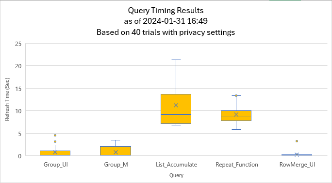
NOTE: The exact values for the different data points are not displayed on the chart as they aren’t really needed to draw our conclusions. Having said that, I’m going to include them anyway, as they should help drive home the details of what you’re seeing.
Group_UI Query Results
Let me zoom in on just the Group_UI query for a second:
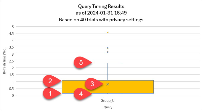
Some of the key data points I want to call out here are:
- The median and the 1st quartile in this chart are both ~0.14 seconds. (They are so close that you cannot see the median line displayed.)
- The 3rd quartile value is ~1.10 seconds
- The mean is ~0.80 seconds
- The minimum value is 0.09 seconds
- The maximum value (excluding outliers) is ~2.34 seconds
The key observations we can make here are:
- 50% of the observed refresh times were between 0.09 and 0.14 seconds, which is why the median is so close to the bottom of the chart. By contrast, 25% of the observations ran between 0.14 seconds and 1.10 seconds (which is essentially the height of the first orange box), and the remaining 25% (excluding outliers) took between 1.10 seconds and 2.34 seconds.
- We do have a couple of outliers which fall outside the bulk of the refreshes.
- With an interquartile range of ~1.01 seconds, the height of the box is fairly short. This indicates that there wasn’t a huge amount of variation in the time each trial took to complete (at least in real time) over 40 runs.
- We can also see that the mean average of ~0.8 seconds is greater than the median of ~0.14 seconds. This indicates that the 4-5 second outliers and maximum refresh times have had an influence on skewing the mean average higher.
On its own, I would suggest that the performance of this query is fairly good as it completes its refresh in less than ~1.10 seconds in 75% of our trials.
The Group_M Query
When we compare the results of Group_M’s trials to that of Group_UI, we can see that it often finished just as quickly as Group_UI as represented by the fact that the lowest values (~0.12 seconds), first quartile (~0.14 seconds) and Median value (~0.16 seconds) are about the same. Despite this, there was more variability in the results than what we saw from Group_UI, as indicated by the fact that the orange box is much taller. (The actual interquartile range for this series is ~1.6 seconds vs ~1.01 for the Group_UI series).
Ultimately, it is fair to say that the performance is similar between these two queries, but that we would expect Group_UI to load faster than Group_M in most (but not all) cases due to the fact that Group_UI’s median is slightly lower and its interquartile ranges is slightly narrower than Group_M’s. Having said this, there does appear to be a higher frequency of outliers which can take longer than Group_M’s in certain circumstances.
Having said all this, these two series are VERY close in performance as to be essentially equivalent.
The List_Accumulate Query
This query shows in stark contrast to the previous two. You don’t need the exact values to see that it consistently takes much longer to refresh (~9.2 seconds) vs the previous two series. You can also see that there is a high amount of variability between refreshes based on the height of the box representing the interquartile range.
Again, we can see that the mean is higher than the median, as well as that the top half of the box is taller than the bottom half. To prove this out, here are the values:
- Minimum: ~6.79 seconds
- 1st Quartile: ~7.07 seconds
- Median: ~9.17 seconds
- 3rd Quartile: ~13.6 seconds
- Maximum: ~21.30 seconds
Notice that the difference between the minimum and median is ~2.38 seconds while the difference between the median 3rd quartile alone is ~4.43 seconds, and the difference between median and maximum is a whopping ~12.13 seconds!
What does this mean? It means that 50% of the time we can expect the refresh to happen within a ~2.38 second range (6.79~9.17 seconds). But it if takes longer than ~9.17 seconds to refresh, it could take significantly longer to complete!
The Repeat Function Query
Next up, let’s look at the repeat function query results. While the median is similar to the List_Accumulate query, the box is much shorter. This indicates that the average refresh times may be similar (or even a bit better) for the Repeat Function query, but the refresh times are much more predictable.
If I had to pick between using these two queries, I would choose this one over the List_Accumulate for the reason that the average (median) performance is similar, but the refresh times are more consistent across multiple runs.
The RowMerge_UI Query
I love this query’s results… it basically looks like a line with an x through it… and one outlier. So what does that mean?
When the box is so short that you can’t see any colour, it essentially means that there is virtually no variation in observations. In other words, in 39 of my 40 trials, this query completed with refresh times ranging between ~0.14 and ~0.20 seconds. That is remarkably fast (hence the position near the axis), as well as remarkably consistent (as backed up by an interquartile range less than 0.06 seconds.) The one outlier we see is that one of the runs took ~3.23 seconds.
Overall Interpretation
At the end of the day, the purpose of a chart is to take data and turn it into information. So what information can you extract from this? Here are my observations keeping in mind that each of these queries is an alternate method to achieve the same output:
- RowMerge_UI is obviously the superior query in this output. It is consistently fast, executing in less than in a second in all but one case.
- List_Accumulate is by far the worst. It is the slowest on average (based on both the highest median and mean values) and has the highest variation during multiple refreshes.
- Group_UI and Group_M appear to be of quite similar performance overall, with Group_UI performing marginally better in most cases. This is probably the most controversial of the interpretation though as it involves your judgement to decide what is more important when making a call between overall refresh times, variation and outliers.
Conclusion
Box and Whisker charts are packed with information once you know how to read them. And I hope that this guide has provided you with sufficient coverage to interpret Box & Whisker plots built on your own data.
3 thoughts on “Reading Excel’s Box and Whisker Chart”
A good read. Very informative and enlightening
Thank you so much for this. Now that I understand those charts better, I think I'll start using them more in MonkeyTools.
Glad to hear it, Nick! These charts are super useful once you understand the key to unlocking them!