This is a special post to to discuss a suggestion to improve the Pivot Table experience, especially for Power Pivot users.
This week I’m at the 2015 MVP Summit in Redmond, WA. It’s a trip I’m lucky enough to make every year, and certainly one of the annual events that I look forward to the most. It’s a chance to reunite with my friends in the global community of Excel experts, as well as make some new friends there too. In addition, we get the opportunity to meet with the Microsoft Excel engineers, give our feedback, and talk about the things that are/aren’t working in the program.
Of course, this doesn’t mean that they can or will implement the suggestions we have. Excel is a massive program, and every feature change can cause bigger issues elsewhere. But they do listen, and they do want this product to be the best it can be. Like every company, they have to work out what they can afford to do, and where the best investments are for their limit of resources.
In the spirit of the summit, I thought I’d share one of the ideas I have that I think would be really beneficial to Power Pivot users. Maybe it makes the radar, maybe it doesn’t, but I think it would be a really useful change. I’m fairly certain it could also be implemented without causing any issues with other features in the product as well.
The Issue
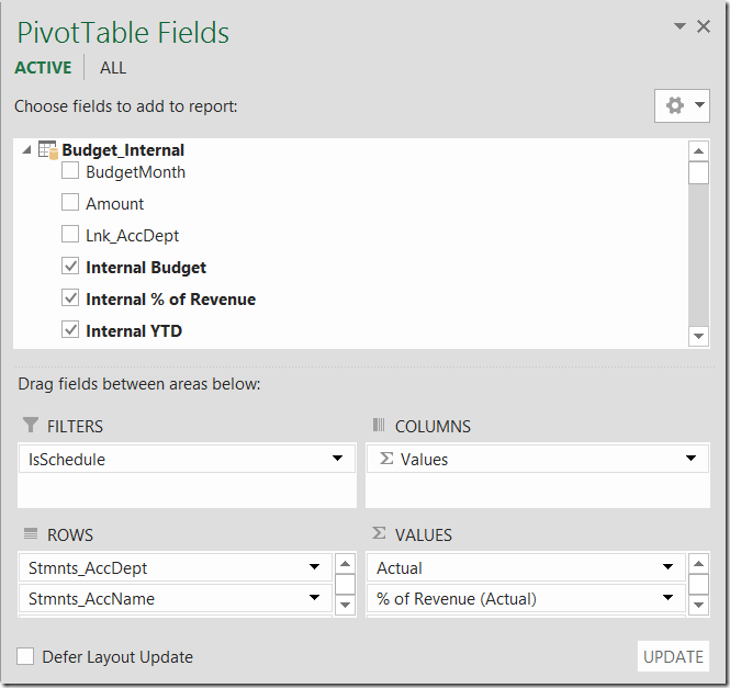
For those working with Power Pivot, you know the power of DAX. This leads to creating many different DAX measures, each of which are landed in the columns of the Pivot Table. This is awesome, but it brings up a challenge with the usability of the Pivot Table field list:
Back when we just dropped singular fields into the Values area, things weren’t so bad. I generally only ran with a few fields, and I didn’t feel super constrained by the size of the window. Yes, I overran the limit on occasion, but it wasn’t a big deal.
With Power Pivot, things have changed. I have so much more flexibility to write the DAX measures I need, which leads to many more columns being defined. If you think about things like forecasting an annual cash flow statement, I’ll write at least 13 different measures (one for each month), plus a total. And that’s just one scenario. For a regular financial statement the same thing… Actual, Budget, Variances, Year to date Actuals, Year to date Budgets, and so on. Again, it’s not uncommon to see a statement with over 12 columns.
This proliferation of measures leads us to the issue… the Values are of the Pivot Table field list is too small today. It only holds 3-4 visible columns at a time. Trying to move a measure into the right place is a real pain, especially if you add a new measure to the bottom, and you have to drag it up. I’m sure you’ve had massive “overscroll” problems where the thing seems to speed up to mach 5 JUST as you are trying to move it up that one last row…
The Slightly Better View
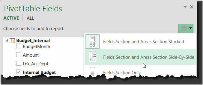
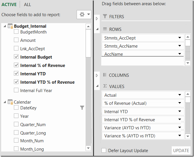
The Pivot Table field list has an alternate view called “Field Section and Areas Section Side-By-Side”.
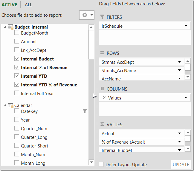
This is a bit better, as we can at least see more fields in the area on the left. But that’s only helpful for scrolling and finding the fields we need, not placing them on the Pivot:
You see? I’ve still only got three rows showing (four when my Excel is maximized on screen.)
But here’s the thing…
When I’m building my Pivot, I rarely end up putting anything in the Filters area, as I tend to use Slicers. I might have a few fields in there that I don’t want users messing with (I hide the top rows of the Pivot Table), but generally I’m looking at between zero and two fields in there.
And when I build my Rows and Columns, I tend to drag them on the Pivot and call it a day. I could use more space on occasion when I’m layering on my Row fields, but Columns are usually sufficient. Especially now that I’m writing DAX formulas. The measure gets dragged in to the Values area, and doesn’t need anything in the Columns area at all. It’s partly for this reason that the small size of the Values area is killing me. The old logic for how the Pivot was build has essentially changed, with the description moving from the Columns area to the Values area.
What that means is that I’ve got a ton of wasted whitespace in my Filters and Columns area. So why not reclaim that whitespace?
Suggestion to Improve the Pivot Table Experience
So here’s my suggestion to improve the Pivot Table experience: modify the “Field Section and Areas Section Side-By-Side” view as follows (excuse the rough mockup…)
The key changes here are really about the arrows to the right of the Filters, Rows, Columns and Values areas. These are the same arrows as used in the Field List on the left, where the white arrow pointing to the right shows the area collapsed, and the black arrow shows the area expanded.
To be clear, the proportions aren’t correct here, but my thought is that the expanded areas consume an equal share of the remaining whitespace. So if all four areas are expanded, they each get a 25% share of the remaining space, as it what we see in the current implementation.
But collapse one field (let’s say Filters), and each remaining area expands, as it now gets a 33% share of the remaining space. Collapse two (as I’ve shown above), and the remaining two get 50% each. Collapse three, and all remaining whitespace goes to the final area:
This would be fantastic, as it would let me build my Pivot much more easily. I’d be able to see what I’m working with, especially on Pivot Tables with higher levels of Row or Values fields.
I didn’t scope this in, but it would also probably be a good idea to append a number in parenthesis to each area as well, indicating how many fields exist in each area. So in this case: 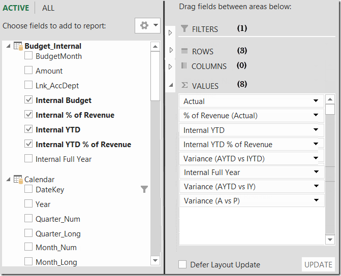
Naturally, when you’re first building a Pivot, it should open with all areas expanded to 25% of the share… but bonus points if there is a way to save the default view for a configured Pivot. The reason that I say this is that my guess is that 75% of the time when I’m modifying a Pivot it’s the Values area I’m doing, 20% is Rows, 4% is Columns and the remaining 1% of the time I’m modifying Filters. Respecting that others have different uses though, the ability to choose which fields are expanded/collapsed by default on an already existing pivot would be incredible.
At any rate, that’s my idea. Here’s hoping a program manager on the Excel team thinks there’s merit to it and starts to look at the feasibility. Feel free to share your thoughts on the subject below. 🙂
If you like this idea...
Please throw it some votes at Excel UserVoice. The more votes it gets there, the more likely it will be implemented!



9 thoughts on “Suggestion to Improve the Pivot Table Experience”
I like it Ken, I hope it gets up.
This is very good idea, Ken.
very, very nice. Thank you.
Pingback: daily 11/02/2015 | Cshonea's Blog
If PowerPivot was an "agile" product like PowerQuery then this would have happened in the next version.
Your best chance is to send this to the PowerBI Team and hope it gets implemented in PowerBI Desktop (and hope they let you connect Excel to the Data Model in PowerBI)
I am in, great idea
I like it Ken. It would also be nice to have a search/filter box on the field list. I'll be cheering you on for this one! 🙂
Pingback: Excel Roundup 20151109 « Contextures Blog
Great idea! Thanks for the mockup.