*Note: The charts in this post are based on sample data and do not reflect any real financial performance.
In setting up my first dashboard, I took a page out of Charley Kyd's book and placed a bunch of little graphs on my report. I tried to use the Camera tool first, but after I had about 7 on the page, the graphs all went to grey backgrounds, and you couldn't see anything anymore. I could not, for the life of me, get them to revert to live images. Very irritating. I suspect that it has something to do with Excel 2007, but I've never used the camera tool in earnest before, so can't be sure.
Just to get this out of the way first, I set up a bunch of charts on a worksheet. I ultimately wanted to show a smaller version of these charts in my dashboard. Unfortunately charts don't scale well when you try to shrink them down, or at least, mine are poorly set up to do so. This is why I wanted to use the camera tool, as it deals with this well.
Since the camera tool was giving me issues, I elected to go with copying my charts and pasting them as images. Adding a little VBA to it, I can wipe all the existing charts on the page, and re-create current chart images. This gives me semi-live chart updates vs the live updates that would have been available if I could have made the camera tool to work for me.
During the process, I found that some of the Paste As Image choices scaled better than others. Here's what I started and ended with:
| Height | Width | |
| Original | 181.9357 | 252.5019 |
| Resized | 80 | 100 |
The formats that you can paste into are PNG, JPEG, GIF, Enhanced Metafile, and Bitmap. I tried all of them.
The ironic thing is that print preview makes the Enhanced Metafile look absolutely awful, as you can see here:
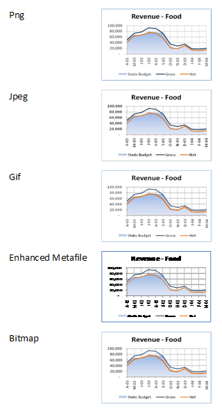
In reality though, once printed out I found that the Enhanced Metafile gave the truest representation to the original of all of the formats. That surprised me a little, as I was kind of expecting PNG to be the best. My thoughts on this, for reference:
PNG: Looked like certain lines were "clipped". The bottom of the number 1 characters, for example, seemed to miss part of the bottom line.
JPEG: Everything looked like it's been bolded, and there seems to be a smattering of extra pixels on the graph. It looks just... "dirty" I guess.
GIF: Numbers are blurred and clipped. Far from professional looking
Bitmap: The second best of the lot, but still looks dirty
The Enhanced Metafile, on the other hand, was crisp, clean and sharp. Despite being scaled out of proportion, it still looks very good.
Just to prove that they do look better, here's a PDF of the printout: imgsample.pdf
I'm curious to other thoughts on this, as this is the first major effort I've concentrated in this area. If you're using pictures, does what I'm looking at hold true for you as well?
6 thoughts on “Best Picture Format for Scaled Charts?”
1. The camera tool is always a bit flaky.
2. JPG will be the worst of the raster images, since its optimization was designed for photographic images. I would not expect much (or any) difference in image quality between PNG, GIF, and BMP. BMP would result in a larger exported file, and GIFs will degrade if there are more than a handful (16? 32? some small power of 2) of colors. Office 2007 may degrade the image through overzealous use of antialiasing,
3. WMF and EMF should look best, since they recreate the actual elements of the chart with drawing objects. Office 2007 messes up metafiles through some strange mappings of chart element to shape type. Axis lines, for example, are represented by rectangles. Gridlines are represented by rectangles with uneditable lines across them.
4. Why not use actual charts?
Pingback: Interesting Links for 17 April 2009 | PTS Blog
I need to use images a lot in PowerPoint presentations. Some comments from that perspective:
EMF is a vector format. Because of that it is freely scalable and will result in best quality.
All other formats are pixel-based and lose quality, especially when enlarged.
PNG usually is the best format for presentations. It's compression is lossless, it can have 16 millions of colors, and can have transparent areas.
JPG uses a lossy compression, thus lines or gradients may look "dirty" due to compression artifacts.
GIF can only use 256 colors, thus gradients lose quality.
BMP is uncompressed, thus has good quality, but tends to be large.
For every small bitmap image: A line cannot be less than one pixel wide. Office uses anti-aliasing to smooth lines, but they need additional pixels. Because of that text in very small font sizes will lose quality, especially in serifs and diagonal lines. Your choice of a sans-serif font (Calibri?) was good, a serif font like Times New Roman or Garamond would look worse.
When exporting images, make them larger than you need them (200 %), then scale them down before printing or displaying on-screen, so the hardware (printer or graphic card) has a bit more information to enhance display quality.
Pingback: The Ken Puls Blog » Blog Archive » Actual Charts vs Images
@Jon: I've put up a new post to (hopefully) answer Question 4.
@Jon & Ute: Thanks for the detailed info on the raster/vector/anti-aliasing stuff. I've never studied how images are rendered, so that's all pretty new to me. 🙂
Pingback: Actual Charts vs Images - Excelguru