In a blog post last week, I was looking at the image formats to use when I snapped a picture of a chart. I'm kind of glad that Jon agreed with my assessment on EMF being the best image format for this, as it at least means I might be on the right track.
Jon also asked a question thought "Why not just use charts?"
Good question, and sorry I didn't respond earlier, Jon. I got wrapped up in the course I was teaching. 😉
Main Purpose:
Just to get it out there, the main purpose of me building these charts was to show them as micro charts on a dashboard. Some inspirational dashboards I was modeling on can be found at Charely Kyd's site. Here's just one of them.
Now, it's ENTIRELY possible that I'm going about this the wrong way, and am about to get schooled. I'm totally okay with that if it's the case. I haven't done any dash-boarding in Excel before, so this is a big experimentation for me. With that in mind, please feel free to offer suggestions or critique. I'm really trying to find the best mix of results and maintainability here.
I think the best approach to explain why not just use charts is to look at what I did along the way. So here's the history of why I went where I did.
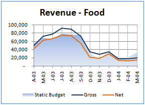
Original Chart:
I created my original chart and got it looking exactly as I wanted. I got the colours the way I wanted, set up my scales to work for me, and I basically got it to where I like the overall display. What I ended up with is the chart below (shown at actual size):
Scaling Attempt 1:
From there, I tried to scale the original chart down to micro chart size, and ended up with this nasty looking thing:
I had a quick look through all the options on the chart, but couldn't find anything that dealt with the scale preservation when shrinking. At least, I did find the "Size" on the Chart Tools --> Format contextual tab on the ribbon, but it didn't seem to help. I could have tried to build it smaller, I guess, but then it would be hard to read on screen to see if it looked okay. In addition, I don't know if I could get everything to the right size. (Font sizes of 1.5, 1.2 or lower maybe?)
Basically, since the scale went all nasty, I gave up and reached toward the camera tool.
Scaling Attempt 2:
I reached towards the camera tool to create snapshots of the charts. Actually, this had another bonus in that I need to create different dashboards from the same data, so I will end up using the same chart more than once. I figured that the camera tool would be a great solution for that, since I would only have to maintain the source chart once.
But the camera tool is flaky. About 6 different charges into the project, I ended up with all the charts suddenly turning grey, and I couldn't get them to come back. Naturally, if you can't rely on it, you really can't use it, so I ditched it and moved on (after wasting a bunch of time trying to make it work).
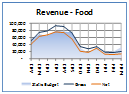
Scaling Attempt 3:
This is where I opted to go with copy the chart and doing a PasteSpecial--> Picture. Using the EMF version I got a nicely scaled micro chart:
This added another benefit as well, actually, in that the dashboard page could be built on a separate sheet from the original data. Maybe it was the way that I set it up, but this seemed difficult to do with the camera tool. (In all fairness, I did NOT try to create a chart with source data on another sheet, but I can't see that being an issue.)
Potential/Known Issues:
I'm not going to say that this is all roses, either though. There are issues here, obviously, maintenance probably being the biggest of them. The image is static, so I had to knock up some VBA code to remove all the existing pictures on the sheet and rebuild them. That actually wasn't a big deal in the grand scheme of things. And at least the charts look consistent with the originals and print well.
In the process, I discovered that you can name charts in Excel 2007 through the UI. (Whooppee, you'd expect that.) But I also discovered that you can name multiple charts the exact same thing. That sucks. Once I'd set up one series of charts, I copied them all to use with my next set of stuff. (You see Food above, but I also have about 9 other product lines to deal with.) I figured I'd just change the source data, but I also had to be very careful to make sure I got the chart names, or I'd have some weird things happening when I referred to those names in code. (I'm floored that we'd be able to name multiple charts on the same sheet with the same name, but there you go.)
I'm also not happy with the difficultly this presents in creating the dashboard for the first time. How do you get the code to recognize the insertion point of the picture on the sheet? The dashboard has numeric data as well, with some (basic) conditional formatting, and the column widths are not consistent. So how do you line up the images with the grid? The short answer is that you can't. So then we get into issues of how to get the image to the correct place.
Thoughts that are currently still cooking
I'm still trying to work my way through this, but I'm starting to wonder if I won't have to force consistent column widths. If I did, I can see a couple of potential solutions to my issues:
- I could then set up a table of chart names and cell references. A little code could then retrieve the chart and place it at the coordinate of the cell specified.
- Rob van Gelder made spark lines by creating a shape via a UDF. This might work if I could feed in the chart name as a parameter but I think it's a non-starter. While you seem to be able to create simple line shapes, I'm running into issues trying to create get the full chart into a (new) shape.
I think I'd actually prefer the latter, but this still kind of sucks as it would probably need consistent column widths to avoid overlapping charts. While it would work well there, I'm not sure I want the rest of my report bound to having extra whitespace.
At any rate, that's what led me into pictures from real charts.
Suggestions, thoughts and comments all welcome.
7 thoughts on “Actual Charts vs Images”
Ken -
There are a couple misconceptions that may have led you astray:
1. Sparklines don't have all the stuff that shrunk your plot down to nothing. No legend, axis labels or lines, etc. Charley Kyd's dashboard charts are not sparklines, but are carefully crafted small charts that include some of the features that caused your problems. In any case, you could simply drag the chart elements into position.
2. A chart can exist on any sheet, not just the one it was created on, or the one which contains its data.
If you are making true sparklines, you can stick with regular charts. You may have to make the chart container larger than the cell range it is to cover (at least in 2003) so the plot area covers the intended range. A little VBA makes this alignment easier.
For a nice sparkline program, you should check out Sparklines for Excel. Fabrice Rimlinger has taken the DDoE efforts of Rob and others, and developed an open source sparkline add-in which is rather impressive.
Hi Jon,
Actually, I wasn't really after sparklines at all. I was just thinking I might be able to make a more maintainable micro chart that way by controlling a shape through a UDF. I think it's a non-starter though, partly for the reasons you mentioned, and partly because I couldn't create a new picture on the fly, which I would need to do.
Re the multiple sheet thing, I got that impression from the camera tool, as I had issues there with multi-sheet. Of course the camera tool is not a chart, and I figured that you probably could use charts in multiple places.
The big question... can I make small charts without ending up in that horrible mess? I'll have to go back and play some more with them...
"can I make small charts without ending up in that horrible mess?"
Sure, but you have to exercise control over Excel's charting defaults. Charley Kyd's Excel User site has a lot of information about making useful dashboard reports, which are based on arrays of small charts.
Hi Ken,
Also look for a thing called nano charts, there spike lines, but are charts rather than formulas, which i think Fab has used.
You can line stuff up, I think the cell has a .top, .left props? no? if I'm wrong, check Andrews blog, he has loads of stuff that works on the grid like that I bet you'll find something there.
I'm working on something not unlike this, I'm putting the charts on the dash board then updating the chart soruces with code, will post when done.
p.s why is you data from 03-04!?!?
Ross
I would also go away from using 20,000 and just use 20
this allows you enough room to use a bigger font so it is still legible as you scale it down
Ross,
Yes, top and left properties are available for charts/images/cells. My issue was coming up with some logic to tie the chart/image to somehwere given that the cell widths might change.
Re the data, it is old sample data. I'm actually working with real data, but I can't blog that.
Hui, fair point. 🙂
Hi Ken,
Why do you need variable column widths for a dash board - will it not be the same lay out all the time - I must be missing something, highly likely! 😉
ta
Ross