Since I know I have a few charting guys that follow this, I figured that I'd ask this question here. Hopefully the response will help someone!
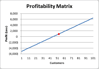
I'm creating a food & beverage function evaluation form, and threw a chart on it. The point behind this chart is to let someone scroll through the number of customers, seeing how much profit the event will earn.
Using a trick that Mike Alexander covers in his latest dashboarding webcast, I added a second chart series. The scroll bar links to a cell and that controls a column of data that shows the value indicating the profit point for the selected customer, or #N/A for anything else. This allows for the single data point on the line chart shown below:
Okay, so this is fine, but it's really hard to tell how many customers and how much profit (or loss) is evident at that point. So I thought I'd add a data label to it. So I selected the series from the legend (not shown on the chart here) and chose to add Data Labels. It came out like this:
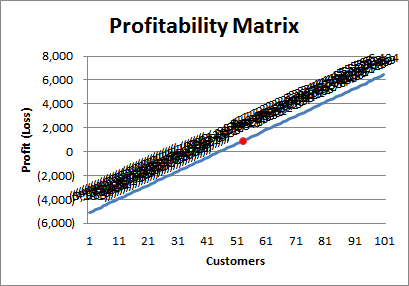
Well that's just nasty. And scrolling through the scroll bar didn't change anything.
With a little playing though, I found that I could set the data points individually. So I tried a little VBA to set each and every data point individually:
Dim c As Long
For c = 1 To 100
ActiveChart.SeriesCollection(2).Points(c).ApplyDataLabels
Next c
Now this was much better, and yielded the following:
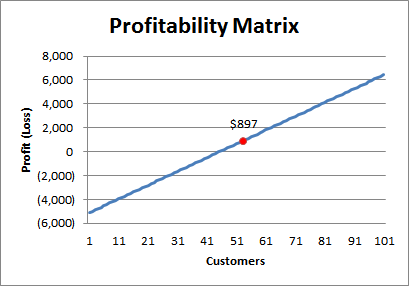
Okay, it's still not perfect, but that's not the point here. Why should I have to set each data point in the series manually to have it correctly recognize that it should not be plotted if the value is #N/A?
I just assumed that this would be a bug at first, but now I'm not so sure. If you have a legend on the chart and hit it with the following code:
ActiveChart.Legend.Select
ActiveChart.Legend.LegendEntries(2).Select
ActiveChart.SetElement (msoElementDataLabelTop)
But then the chart turns back into the first one I showed, with all the clustered nasty elements. So does this mean that telling Excel that you'd like Data Labels on your series is not the same as "turning on" a collection of data labels? I would have assumed that it was intended to be the same.
I'm curious as to people's thoughts here: is this a bug, or a feature? I'm still leaning towards bug, since it seems to be attempting to display the #N/A values, which are not supposed to be charted.
What do you think?
8 thoughts on “Data Labels on Chart Series”
Hi Ken,
Looks like a bug to me. The lack of a true empty value for a chart has always been problematic.
BTW, have you considered using a scatter chart and showing the full series, plus just one point in the second series?
Here is a sample on skydrive http://cid-58382ac201cc36d6.office.live.com/self.aspx/Public/SelectOnePoint.xlsx
Hi Ed,
Thanks for the comment!
With regards to the scatter chart... no... can't say that I've ever used one, to be honest. I'm going to have to give that a go and see if I can make it work. 🙂
I think that selecting the series using the data legend doesn't really select the series, and so when you are adding data labels it it adding them to series 1 (the default) rather than series 2 (the series you had hoped to select). I'm using excel 2010, and if I select the Series 2 legend series, then click the Data Labels icon in the layout tab and select say the 'centre' option it adds data labels for series 1, not series two.
Forgot to add that instead of trying to select the series from the legend, instead you want to click somewhere in the chart and hit the down arrow until you see the 2nd series chart formula show up in the formula bar. Then if you add data labels you know they are getting added to the right series.
You should be able to put your single point on a Secondary Axis, then add the data label
oops pressed enter too early on my last comment.
What I was meaning to say is that after you put your single point on the Secondary Axis, you can simply apply the data lable without having to select the point (since there is only one point anyway).
Applying data labels when the legend is selected will apply data labels to all the series in the chart.
Your screen shot of data labels would suggest that the information is in fact the values of the first series rather than multiple #N/As
Select the actual series before applying data labels.
Thanks for the comments guys,
Jeff, I was using the right arrow key. I didn't realize that it took me from all points on Series one to the first point of series one. I mistakenly assumed that it was a point on Series 2. Hitting the down arrow a few times gets me to the next series. And turning on data labels there works as expected!
Mike, couldn't do it on the one point as I used your technique to link it to a scroll bar. So once I incrmented the bar, the data label went away. It would seem that clicking the one point sets the label for that point only, and it doesn't hold when you move to another one.
Andy, your'e correct. My Series 1 is all numbers, my series 2 is all #N/A except for one value. I didn't realize that selecting an individual series from the legend will default back to Series 1. That just seems weird to me.