I came across this a while ago in a weather app on my iPhone, and thought it was interesting. Then there was a conversation on Twitter in which I brought it up as well.
I'm not a huge fan of pie charts at all. But for some reason I kind of liked the concept behind this one. I know that we have less than 12 hours of daylight here in winter, but it was kind of interesting to see it visualized. To be honest, I think it's probably the only time I've looked at a pie chart and thought "Wow. That actually tells a story of some kind!"
I've reproduced it here, just for fun:
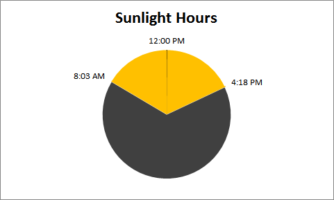
It's based on the actual sunrise/sunset times for today (December 14, 2010) in Nanaimo.
7 thoughts on “Pie Chart of Daylight Hours”
There was a 5 minute eclipse right at noon?
Surely, it fails on all fronts. 12:00PM should be at the bottom, and how much of the day is daylight? To my eye it looks to be just under 40%, but is actually 34.4%.
Even in a simple two case example, pie fails for me.
Bob -
Why should noon be on the bottom? The sun is overhead at noon, and putting noon (and the daylight segment) at the top somehow acknowledges this.
For a quick glance between two opposing categories, a pie isn't terrible. If you need exact numbers, then the pie doesn't work.
Jeff, a cloud passed over the pie chart at noon. (Seriously, I just wanted to mark where it was.)
Bob, I get what you're saying, but I don't know that it's relevant. The point of this chart to me wasn't to really nail it down to incredible precision, but more to show the approximate part of the day where the sun was up. It's less than 12 hours, obviously.
Jon, I agree with your points. I put noon at the top as it seemed more... true? to the way we view time. (High noon.)
So you need a chart to tell you the amount of daylight hours is, approximately between 8:00AM (approximately) and 4:00PM (approximately)? 16-8 (approximately) is 8 (approximately), there are 24 hours in a day (exactly), so approximately 1/3rd of the day is daylight. Look ma, no pie chart!
Methinks you would make a good senior executive.
Jon,
Because the day starts at 0 hours, and when you look at a circle that associates with time, you automatically start at the top (well, I do). The pie may not be awful, although I think it is, but it is totally pointless as it is totally unnecessary (see my last reply to Ken).
I like this pie chart because it looks like a clock, gives me a good sense of how much time I have for daylight activities, and looks remarkably similar to the Daylight app I have on my iPhone. The other thing I noticed is that, just south of you, in Marysville, WA, on the same date, the sunrise/sunset times are 7:51 AM and 4:15 PM. I didn't think there would be that much difference, but it is ~150 miles.