Last week I got an email from one of our readers, with some feedback related to how Monkey Tools’ PivotSleuth works with Measure tables in Power Pivot.
Best practices is to set up a disconnected table to house DAX measures. Because of this - all of the fields listed in the Pivot Sleuth end up being RED. So it is not really useful. Is there away around this? Other than incorporating your DAX measures in an actual table?
And is this the reason for the " You might need a relationship" annoyance from Excel?
Personally, I challenge the term “best practices” here, as I think it’s borne a bit out of history, and no longer relevant. But more on that below...
My favourite part about this email was the last line, as this specific problem is actually one of the main reasons we wrote this feature. Let’s take a look and see what PivotSleuth says about this…
Model Background
The model framework I’m using looks like this:
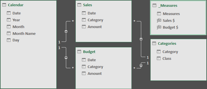
As you can see, we have a separate _Measures table in this instance, where all the measures are collected, rather than storing the measures on the Sales & Budget tables. They’re not complex at all, in fact, they’re about the easiest measures you could create:
- Sales $: =SUM( Sales[Amount] )
- Budget $: =SUM( Budgets[Amount] )
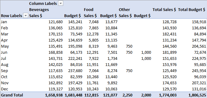
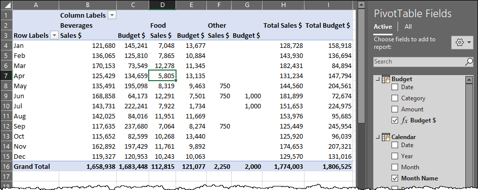
And when you drag them on to a PivotTable, they work nicely:
So, if everything is fine, what’s the issue?
It’s all about this nagging little message:
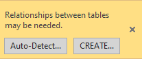
Why is it here?
PivotSleuth and Measure Tables
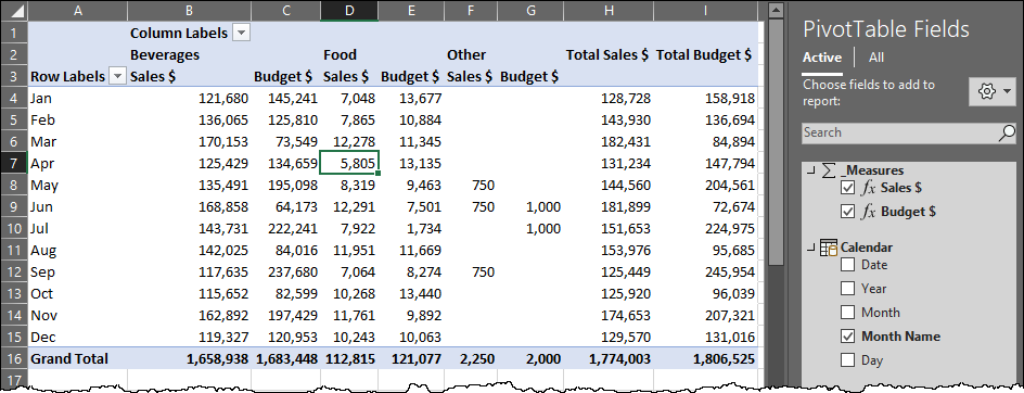
When you launch PivotSleuth against this PivotTable, you see the following:
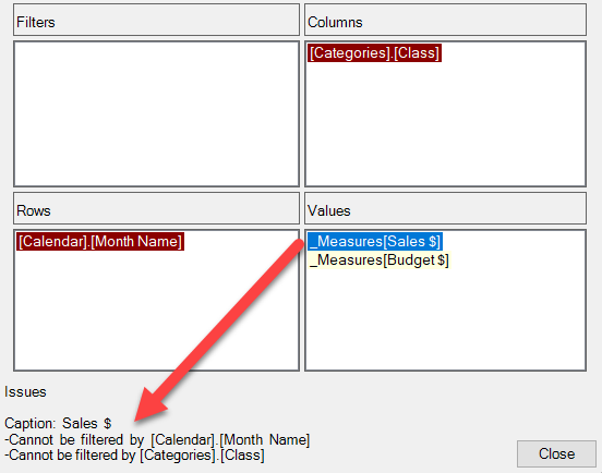
Why are all the fields red? The answer is shown when you select one of the measures: there is no relationship between the Sales, Categories, or Calendar tables.
So, what happens when you store these measures on the Sales and Budget tables? The irritating message goes away:
(Interested in the other things Monkey Tools does? Check it out here!)
Why do People Create Measure Tables Anyway?
The practice of storing measures on another table as a recommended practice was born out of Power Pivot instability, back when things crashed a ton. Sometimes the fix would require removing the table from the data model and re-creating it, at which point you’d lose any measures or relationships built on those tables. It was frustrating and annoying, and led people to keeping their measures into a separate table to protect themselves from having to do that work. The challenge, however, was that it caused a “Relationships May be Needed” message every single time you used a measure. And there was no way to make that go away.
Since 2016, Microsoft focused on fixing bugs related to Power Pivot, with many of them making their way back into the Excel 2016 product, even if they were fixed after 2019 was released. While they’re certainly not all gone, it’s unusual to see issues that force the need for tables to be deleted and rebuilt now. To me, this reason for separating your DAX has basically become a non-issue, but the habit still remains.
Some people also argue that this gives you a central place to go to get your measures. I’d argue that the list can become overwhelming when all your measures are in one folder without any categorization. (Unlike Power BI, we can’t group measures into folders.)
I far prefer to put my measures on the appropriate tables, then hide all the unaggregated columns on the table. This offers three benefits:
- It groups the measures by table, making them easier to find. (Sure, you can use the search function, if you like. I’m just saying those tables act like folders.)
- It means the “Relationships May be Needed” warning only shows up when a measure can’t be cross filtered by a natural relationship in the model.
- It changes the icon of the table to the sigma icon (?), which is synonymous with measures.
The Benefits of Hidden Columns
Let’s take a quick look at the benefits of hiding every unaggregated column in the data model, essentially leaving only measures visible on your table. This is super easy to do: you just hop into the Power Pivot window, right click every natural column and choose “Hide from Client Tools”. (I personally prefer to do this in Diagram view, but it works in table view as well.) The results are pretty impactful when you look at the PivotTable field list:
Notice that the tables are now flagged as “Measure Tables”. They inherit the sigma icon, as well as move to the top of the list. This is the primary reason I prefer to work this way… the measures are grouped logically based on their tables. Essentially, they act like Measure Folders.
Full Disclosure on PivotSleuth
As I was writing up this post, I discovered something that I hadn’t tripped on yet. Look what happens when I hide all unaggregated measures on a Measure table:
Notice that there is no “Relationships May be Needed” message. I didn’t realize that this flag would change that, and as of today Monkey Tools doesn’t check for this, so still shows all read. So, it looks like we need to update our logic a bit to add some more functionality. 🙂
Conclusion
Hopefully we both learned something here!
Personally, I’m sticking with the individual table approach, and storing my measures as close to the table they summarize. I like the ability that it categorizes my measures. But ultimately, it’s cool that we have the ability to work the way we want to work.
And we’ll look at modifying Monkey Tools to avoid showing red when – and only when – you’ve hidden every unaggregated column on your measure table.
PS: Did you know that you can’t call a table “Measures”? It’s a reserved word, so will give you a table called “A”. That’s why I went with “_Measures”
2 thoughts on “PivotSleuth and Measure Tables”
There is always be a need to group 'related things'.
I too always created 'Measure Tables' in the past, but now only group measures in in the Fact table (in PowerBI). Just because it's quicker/easier - otherwise I wouldn't.
I think this works well in small data models, but becomes messy in bigger models.
Another thing is the Naming convention - learn to read/write Measures Top-Down when it's sorted Alphabetically; Country count (Noun-Verb), instead of Count of Country (Verb-Noun) --- as any Culture, it's just different.
Pingback: Monkey Tools Update Now Available - The Excelguru BlogThe Excelguru Blog