For those coming from the Excel 2013 world, you’ll surely want to create filters using the Power BI Slicers. After all, you know that Slicers and Timelines are two of the sexiest filters we have for controlling filter context in Power Pivot models. In this post we’re going to explore the slicer visual, and how to get closer to what you’re used to in Excel.
The Goal
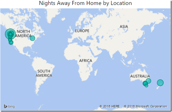
I’m going to fall back to my last project here, and have created a single visual on a blank report page. You probably remember this one, it’s the map of where I’ve stayed so far this year:
What I’d like to do now is add my slicers and timelines. I’d like a slicers for Country and Province. Should be easy, no? Err… no. ![]()
The default Power BI Slicers
Now, Power BI Desktop has a Slicer visualization, as you can see here:
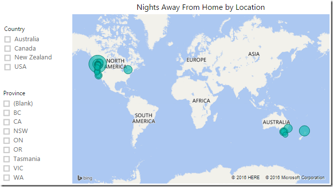
So what’s wrong with it? I’ll build two to show you why I’m less than satisfied… Here’s what I did:
- Created a Slicer visual
- Added the Country field
- Created another Slicer visual
- Added the Province field
Do these look like Excel slicers to you? They look a lot more like check boxes to me, not slicers…
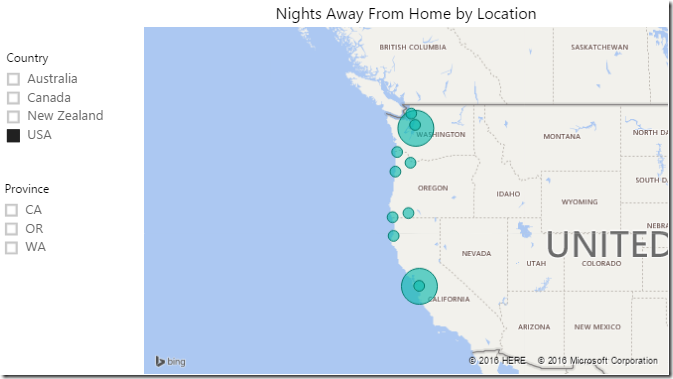
Now don’t get me wrong, Power BI Slicers certainly work, as you can see here where I’ve drilled in to USA:
So let’s look at the difference between the Power BI Slicers and the Excel slicers that my expectations are based upon:
- The Province field hides all irrelevant items by default, unlike Excel. I could not find a configuration option to change this.
- The checkbox thing drives me crazy. I hate checkboxes in my Windows files list, I don’t like them here, and again it is inconsistent with Excel. I could not find a way to turn those off.
- Originally I wanted to show the provinces in a two column slicer, like I can in Excel. I could not figure out how to make this happen either.
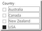
- Finally, I wanted to show the bubbles like an Excel slicer. The closest I could get was the image below (WARNING! SUPER UGLY GRAPHIC AHEAD!) Should you feel the need to create this abomination you need to select the slicer, go to the Formatting roller –> Items –> Outline –> Frame.
Gross. That is just gross. Honestly, I really don’t understand why the slicer is so different from Excel’s. That slicer is pretty, and people are used to it.
Not happy with these, I deleted both slicers.
Is all hope lost for attractive Power BI Slicers?
Thankfully, the answer is no. The Power BI team has given developers the ability to create and distribute their own visuals into the Power BI custom visuals gallery. So let’s go and pull in a couple of those to fill this gap.
Locating the Custom Visuals Gallery
To be fair, the steps for this could be MUCH easier. To get here the first time you can either just click this link or follow these steps:
- Click the ellipses in the Visualizations gallery to import a custom visualization
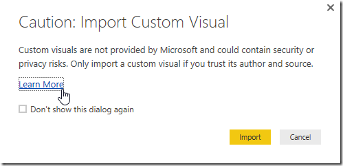
- Choose to Import a Custom Visual
- Click the Learn More link
- To be fair, you should probably read the page you’re taken to, as it talks about all the risks of using a custom visual. (Remember not all custom visuals are provided by Microsoft, many are provided by 3rd parties.)
- I scrolled straight to the bottom and clicked the link in the See Also section to go to the Power BI custom visuals gallery
You’ll be taken to the gallery, which has a lot of pretty visuals that can be imported into your project.
To make it easier to find custom visuals, I’d recommend you do a couple of things here:
- Bookmark this page (making it a bit easier to get back to it.)
- Choose to sort the gallery by Name rather than by Most Recent (which is the default)
When you click on a visual it will offer to download a pbiviz file that you can store in a folder. You’ll want to remember the location, as you’ll need to import the visuals into every new PBI file you create.
I downloaded a specific visual here: the Chiclet Slicer which, ironically, is published by Microsoft.
Importing the Chiclet Slicer
When I returned to Power BI desktop, it’s still sitting at the Import Custom Visual dialog, which is convenient. So I was able to just click the big yellow Import button, and select the ChicletSlicer file. Doing so adds a new option to the Visualizations gallery:
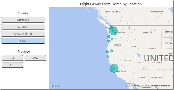
I created two new Chiclet slicers, one for Country and one for Province, and was pleased to end up with the following:
Now that’s more like it! Certainly needs some tweaking, but better than the past iteration. So let’s get to that tweaking… I changed the formatting options for each of the slicers as follows:
- The Country slicer
- General –> Columns –> 1
- Header –> Off
- Chiclets
- Unselected Color = very light grey
- Title –> On
- Text = Country, Font Color = Black, Alignment = Center, Text Size = 10
- The Province slicer
- General –> Columns –> 2
- Header –> Off
- Chiclets
- Unselected Color = very light grey
- Title –> On
- Text = Country, Font Color = Black, Alignment = Center, Text Size = 10
And, as you can see, the results are pretty good:
A couple of things that I couldn’t figure out here though:
- I wanted to align the text in my “chiclets” to the left, like in Excel. Can’t seem to find an option for that.
- There is a tantalizing option in the “General” section to show disabled items “Inplace”, and an option in the chiclets to set the colour for those items. I would have expected it to be equivalent to Excel’s “Show Disabled”, but it doesn’t seem to do that. I have not figured out how to replicate that effect.
Final Thoughts
To be fair, there are a ton of configuration options for the Chiclet slicer, much more than I’m going to cover. Why this slicer isn’t part of Power BI’s default install is beyond me… especially since it’s published by Microsoft.






6 thoughts on “Power BI Slicers”
If you switch the standard inbuilt slicer from vertical to horizontal (in the formatting options) it is much closer to the Excel experience - except the slicer is horizontal of course.
Great post; I concur with all what is being said...
Besides the described differences between slicers in Excel and the PowerBI alternatives, I have the sensation that Excel with its slicers is a bit more responsive than PowerBI... This is what I am finding when using the same dataset in Excel vs PowerBI (both Desktop versions, in the same computer). It is just a split second but noticeable... Do others also agree that slicers in Excel are faster??
The Chiclet slicer also lets you have pictures rather than text.
So for example in case of countries - you can have their Flags embedded as pictures rather than just text
@ Anselmo, I honestly haven't looked into this at all.
@ Sam, awesome. Will have to have a play with this. Most of my data doesn't have pictures in it, but I'm sure I can fix that.
@ Matt... meh. You're right, except that how do we tell it to wrap to another row? Still not happy with it.
I am using the Chiclet slicers, but need to be able to have my text left-aligned.
Is this possible?
If it's not an option, do you know anything about creating custom visuals, maybe changing the chiclet slicer default settings, or any other work-around?
Not that I'm aware of Liam (I can't see an option). You might want to have a look at Charticulator, as it may be able to build a custom visual to do this. (It's not an area I have experience in though.)