In this post I’m going to explore the options for Visual Interactions in Power BI … in other words, I’m going to explore the options to control what happens to other visuals when you select one in Power BI.
Visual Interactions in Power BI – The default experience
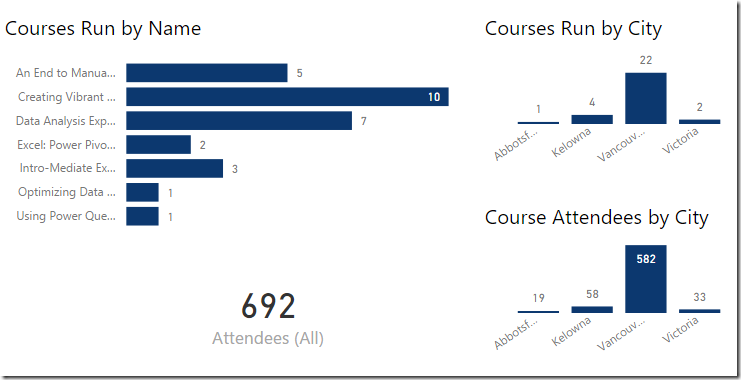
Let’s take a quick look at a report and see what happens when we select a visual. Here’s a simple report with 3 charts and a card:
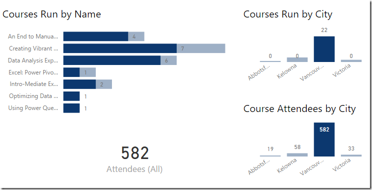
And, when we click one of the visuals, it cross filters each of the others. In the case below, I’ve clicked “Vancouver” in the “Course Attendees by City” visual, and it has cross filtered all the rest:
Okay, so no secret there. The important things to remember here are that:
- I didn’t need to do anything to set up the linkage for the visual interactions in Power BI, and
- The cross filtering is applied to show the currently selected portion of the whole
But what if we didn’t want this?
The 3 Options for Visual Interactions in Power BI
There are actually three different states for visual interactions in Power BI:
- Highlight (the default experience of cross-filtering with shading)
- Filter (cross-filtering to show the contextual values only)
- None (do not filter)
You can find each by selecting any visual on your report in Power BI Desktop, then go to Visual Tools –> Format –> Edit Interactions.
Let’s take a look at each of them.
Visual Interactions in Power BI – Highlight
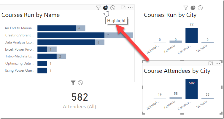
As mentioned above, this is the default of the visual interactions in Power BI. You don’t need to set up anything to get this behaviour. If you monkey with it, however, you can get back to it by selecting a different visual, then clicking the little pie chart icon that appears above the visual you want to modify.
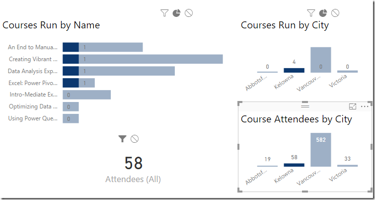
The only other thing I want to call out here is what happens when we select a set of data that filters all records out of another visual. In the case below, I’ve selected Kelowna in the Course Attendees by City chart. As you can see only four of our courses have been led in Kelowna:
Notice that the last three courses still show, even though we never ran them in this city. Why? Because the visuals indicate that we’ve led all our other courses somewhere, but obviously not in Kelowna.
Visual Interactions in Power BI – Filter
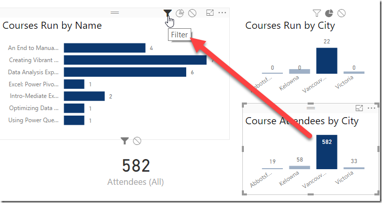
The next icon to the left of the pie chart is the Filter icon. This toggles the visual slightly:
The key difference here is that the shaded portion is gone. This gives the appearance of drilling in to the data a little more, without preserving the concept of how this data relates to the whole.
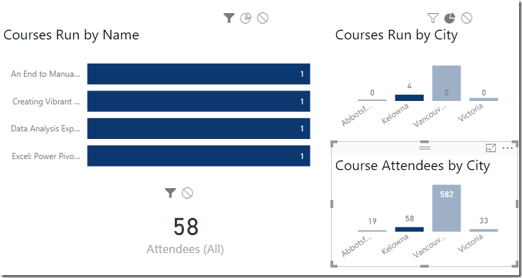
Now, check out what happens when we select Kelowna:
The Courses Run by Name visual no longer holds any data about the whole, allowing it to remove the irrelevant courses. End result here is that we’re able to focus on the data that exists in this context only, without contaminating it with irrelevant data.
To be fair, most of the time I actually quite like the version with the shaded values. But if you have a long list of data then this can certainly help trim it down so you don’t have to scroll the visuals as much.
Visual Interactions in Power BI – None
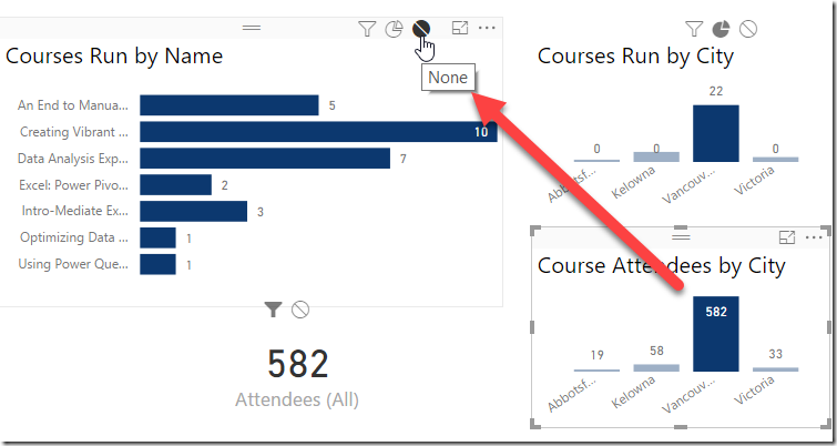
The last method we can configure for visual interactions in Power BI is to set the filter behaviour to None. This prevents any filtering from taking place on a visual with this property set:
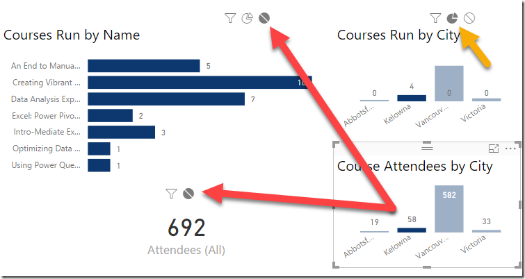
At first this looks quite similar to the Filter setting, but the key here is that the data in the Courses Run by Name visual has not been filtered at all, unlike the other two chart visuals and the card visual. To display the effects just a bit further, the image below shows the card visual set to None, and the city filtered to Kelowna:
Notice that this time the Attendees card shows the true total for All Attendees. The Courses Run by City visual, however, is filtering, as I left this in “Highlight” mode.
A key observation
I haven’t called this out yet, but should: we can set up different actions for each visual on the report. That adds a fair amount of flexibility in order to get your report filtering working just the want you want.
A weird Visual Interaction
Before you look at the next visualization, I want you be keenly aware of this fact:
All visual interactions we set up as shown in the last image above. I changed nothing else.
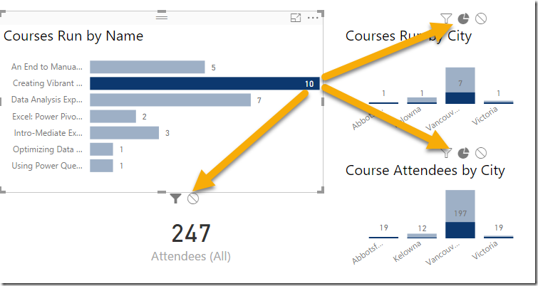
Keeping that in mind, look what happens when I click on the Creating Vibrant Dashboards course:
It cross filters all other visuals using the default interactions!
This is kind of a key thing to be aware of. Just because I customized the visual interactions for the Course Attendees by City visual, it doesn’t force those relationships back the other way. This means that I can customize how each visual affects the rest of the visuals on the page. How cool is that?
The one missing setting
There is one setting that is badly missing, and that is the ability to persist selections when you select multiple visual filters. What I mean by this is that I should be able to click on Vancouver, then click on the Creating Vibrant Dashboards selections to select only records that meet both of those criteria. Alas there is no setting to do this today. You can set this up using drill down, but this means you need to think about what the user wants in advance and build it out, which is pretty tough if you have lots of potential filter combinations.


One thought on “Visual Interactions in Power BI”
Really useful article. I feel more comfortable already knowing a bit more what those icons actually do
Now if they can only :
Get a 'global filter' sorted out. I select a region on my front page and it auto filters my region filters on other pages
Provide ability to hide that black fly away menu on rhs (report level filters). Just gives users ability to monkey things (good turn of phrase!)