In this post I’m going to continue the process of creating a Power BI dashboard built off the data I sourced from OneDrive for Business. This time I’m going to look specifically at creating Power BI Card Visuals.
Series Table of Contents
This is a portion of a series of blog posts, which build on each other to create an overall solution from Data to a Power BI dashboard. You’ll want to follow along in order, so here’s the table of contents for the series:
- Get Data From OneDrive for Business
- Creating Power BI Visuals
- Creating Power BI Card Visuals (this post)
- Sharing Power BI Reports (for External Users)
- Sharing Power BI Dashboards
Today’s Goals – Adding Power BI Card Visuals and another Chart
Let’s just circle back on the wireframe I presented in my last post:
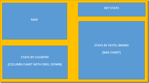
I’ve already made the Map and the Stays by Country chart. Now I need to add my Key Stats and the Stays by Hotel Brand chart.
Showing Key Stats with Power BI Card Visuals
Ultimately, what I want to show on my dashboard is some key indicators that filter as I select other visuals on the dashboard. Something that looks like this, which is reacting to my filtering to only stays in Canada:

Creating DAX Measures for my Power BI Card Visuals
So the first thing I want to do is think about the data that I want to display. I’m tracking nights away from home, which I call (Hotel) “Stays”. There’s 3 main measures that I’m after:
- Stays (Selected): This is base measure which was created in the last post in the series.
- Stays (All): This value should always show the total nights I’ve been away from home.
- Stays (YTD): This value should show the total nights I’ve been away from home for the current year only.
As a reminder, the Stays (Selected) measure was defined as:
Stays (Selected) = COUNTROWS(Stays)
Creating the next two measures is just as easy as the previous one. To do this I selected the Modeling tab –> New Measure, and created the following measure formulas:
Stays (All) = CALCULATE(Stays[Stays (Selected)],ALL(Stays))
Stays (YTD) = CALCULATE(Stays[Stays (All)],Year(Stays[Date])=Year(TODAY()))
Each was set with a whole number format with commas and zero decimal places:

Now, to be fair, you don’t have to set up all your DAX measures up front. You can (and I frequently do) create DAX measures as you need them. I had already visualized what I wanted, so knew I’d need these ones.
Multi-Row Power BI Card Visuals or Single Cards?
So now that I have my DAX measures built, I’m want to get these into the cards. My first instinct was to grab a multi-row Power BI card visual and just check all 3 measures. The problem is that it gives me this:

Now, I can get rid of the bar on the left (Formatting –> Card –> Show Bar = off), and I can change the size of the values (Formatting –> Data Labels –> Text Size). What I can’t do, however, is centre the values over the text like I can with individual cards. (At least not as of the latest build of Power BI Desktop.) It’s always the little things that get me, but it looks like we’re going to need to go to individual cards for what I want.
Creating my Power BI Card Visuals
Creating 3 visuals instead of one is a little bit painful, but certainly do-able. Here’s how I did it.
- I went to the Visualizations gallery –> Card
- Then went to Fields –> Stays (Selected)

Which gave me this:

Perfect. So then I just created the other two. The hardest part, honestly, was lining them up. Rather than dragging and drop I set the properties manually, as I could then ensure that my card heights and widths and top position were identical. I then only hard to play around with the X position for each card. (You can find this menu by selecting the card, then clicking the format icon (under the visualizations gallery). Once you’ve done this, expand the General section.

One thing that does bug me about this is that as soon as you select the next visual, the General section will collapse on you again. I really wish it stayed expanded, as it would make it much easier to quickly compare values.
Regardless, I ended up with the visuals I wanted and they react properly when I click Canada in my Country column chart:

Or Australia:

Creating the Stays by Hotel Brand chart
With the key stats done, we can now focus on creating a Power BI Bar Chart to show the Stays by Hotel Brand. There’s no major secret to this one, in fact it’s even easier than the column chart I created in the last post, only because it doesn’t have any drill down levels. Here’s what I did to create this one.
- I started by clicking on the blank canvas (to clear selections so I don’t accidentally turn a card into a chart!)
- I went to the Visualizations gallery and selected the top left icon for the Bar Chart
- I checked Hotel Brand – automatically adding it to the Axis
- I checked Stays (Selected) – automatically adding it to the Values area

That seemed pretty easy so far, but it could use some tweaking. So I clicked the formatting roller and made a few more adjustments to it:
- X-Axis = Off
- Data Labels = On
- Title
- Title Text = Nights Away From Home by Hotel Brand
- Font color = Black
- Alignment = Centre
- Text Size = 12 pt
And then I resized the chart to show the full width of the hotel brand names.

There are a couple of options I’d love to see here that don’t exist today, mainly revolving around the Y axis.
- While I have the option to show the axis on the right side, I don’t have any ability to align the text to the left. Personally I can’t stand the fact that the text is not aligned with every word started at the same horizontal position. It’s just weird.
- In order to show all the text, I have to expand the entire chart, making it super wide. Why? Because I don’t have the ability to set the axis width independently, nor do I have the ability to control the font size for the axis.
At any rate, it looks pretty good for my purposes right now, and I’m sure the font size and alignment (if not the axis column width) will be added in future.
Most importantly, we can see that by filtering my Nights Away from Home chart, it still cross filters this chart. The view below shows just how brand loyal I’m not when filtered to Canada:

Final Thoughts
With a couple of additional text boxes added to the page, my dashboard development is complete, returning something that I can easily cross filter and explore:

Note that I started this post a while ago, so the data has a few more nights in this version of the screenshot.
Next Post
In the next post I’ll look at publishing this to Power BI, creating an interactive view for the public, and schedule the refresh to keep it up to date.
4 thoughts on “Creating Power BI Card Visuals”
Another excellent one and I'm thinking you seriously have a book opportunity here in the same manner as Data Monkey!
There's a massive vacuum for training on visuals alone never mind the other aspects of Power BI. I know it's a moving target but training sources are in short supply
I'd be first in line to buy it Ken!
Thanks Anthony, I'll keep that in mind! 🙂
Pingback: Creating Power BI Visuals - Excelguru
Pingback: Sharing Power BI Reports (for External Users) - Excelguru