Last week I grabbed some data from OneDrive for Business. This week I’m going to start the process of creating Power BI visuals to build a dashboard which will be hosted in the cloud.
Series Table of Contents
This is a portion of a series of blog posts, which build on each other to create an overall solution from Data to a Power BI dashboard. You’ll want to follow along in order, so here’s the table of contents for the series:
- Get Data From OneDrive for Business
- Creating Power BI Visuals (this post)
- Creating Power BI Card Visuals
- Sharing Power BI Reports (for External Users)
- Sharing Power BI Dashboards
Dashboard Wireframe
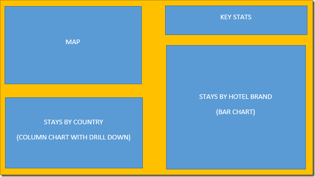
My friend Jon Peltier exposed me to the concept of creating a wireframe for a dashboard, which is essentially a quick design layout. (It’s more complicated than that, but for my purpose I know my key stats, so am looking at the layout now.) So here’s the draft of what and how I want to place my visuals:
Now, I’m not going to build all of this in this one post. (I’m only going to build the left side in this post.)
A little DAX – Creating a measure for Selected Stays
Before we get too deep into this, we need to quickly talk about about the key metric is that we want to display in the dashboard visuals. All maps and charts show key values of some kind, in my case I’d like that to be the number of nights that I’ve been away from my home. As I mainly stay in hotels when I’m away, I’m going to call the measure “Stays (Selected)”. (The reason for the “Selected” component will become clear in the next post.)
To create this measure, I needed to go to the Modeling tab and choose New Measure. In Power BI Desktop, you provide both the measure name in the formula bar, as well as the actual measure itself. So here’s what I went with:
Stays (Selected) = COUNTROWS(Stays)
The measure name comes first, followed by the = character. (In Power Pivot for Excel, we’d see := instead.) The measure itself uses the same DAX formula as we would in Excel, which is a simple count of all unfiltered rows remaining in the table. This is good, as it will allow my reports to cross filter based on selections made in other visuals.
The final thing I did after creating the measure was to tweak the formatting a little bit. I set it to Whole Number, ensuring that it had 0 decimal places and used a comma format (for when my hotel nights creep over 1,000!)
Power BI Visuals – Map
With the DAX measure built, I’m ready to finally start using my data. And I really want to start with something visual, so I’m going to start with the map.
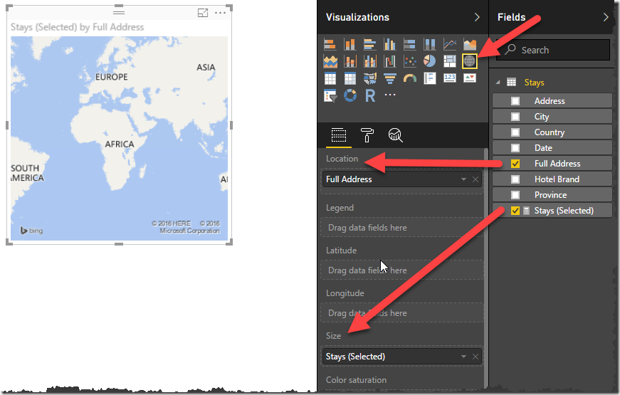
There are two Power BI visuals for maps in Power BI Desktop; the map and the filled map. I’m going to use the first one. So here’s exactly what I did:
- I clicked the Power BI Visual for Map
- I selected the Full Address field
- I selected the Stays (Selected) field
- I wondered why nothing showed up on my map
Oh yes, this was a serious WTF moment, honestly. Here’s what I saw (with arrows added to prove out the mapping):
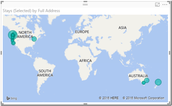
I recreated this map twice and added other visuals before I figured out what was going on here… as it happens, my data was actually too wide for the default map size. Look what happens when I widen the map:
So Power BI team, if you’re reading this, the default size of the map is just plain wrong. Give us one that shows the entire world!
At any rate, now that this I know my data is actually there, I can clean up the chart by giving it a better title. To do that I:
- Selected the map visual
- Clicked the format icon under the Visualizations gallery (now looks like a little paint roller)
- Expanded the Title field
- Change the Title Text to: Nights Away From Home by Location
- Changed the Font color to black
- Changed the Alignment to Center
- Set the Text Size to 12
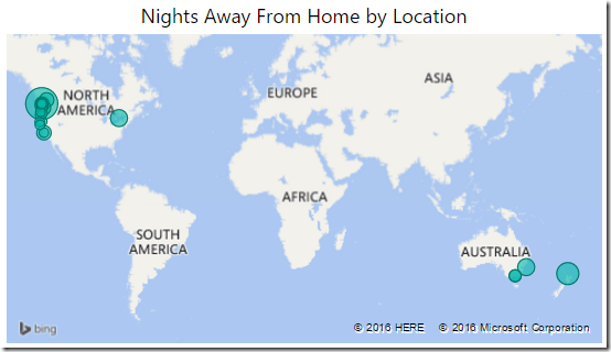
And the result is as follows:
Power BI Visuals – A Basic Column Chart
With the map done, it’s now time to move on to the next Power BI Visual: a column chart.
To create this, I did the following:
- Clicked the blank canvas outside my map. (I can’t tell you how many times I’ve pressed CTRL+Z to undo changing a visual from one type to another!)
- Clicked the Column Chart (second icon in the Visualizations gallery)
- Selected Country from the fields list
- Selected Stays (Selected) from the fields list
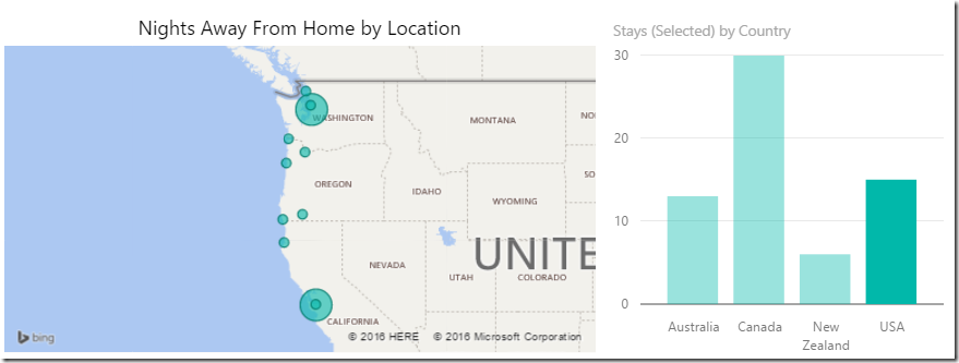
Not only do I get my cool chart, but clicking on one the countries drills in to all the stays I’ve had, and zooms in the map as well. No extra connections or configuration needed. In this image I’ve drilled in to USA, and you can see that I worked my way down the Oregon coast this summer, as well as the stays I had in the Seattle and San Jose areas for conferences:
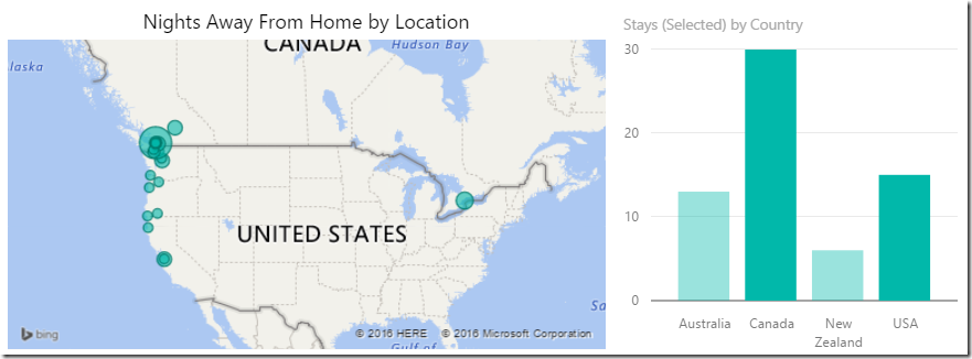
Using the chart is pretty easy at this stage: just click a bar. Click a different bar and it cross filters to those selections, click the same bar again and it un-filters. Hold down your CTRL key as you’re making selections and you can even get multiple countries like this view of Canada and USA:
As cool as that is, I’d still like to customize the chart a little. To do so, I selected the chart and clicked the formatting icon below the visualization gallery again. The changes I made were:
- Y-Axis
- Off
- Data Labels
- On
- All other options left as defaults
- Title
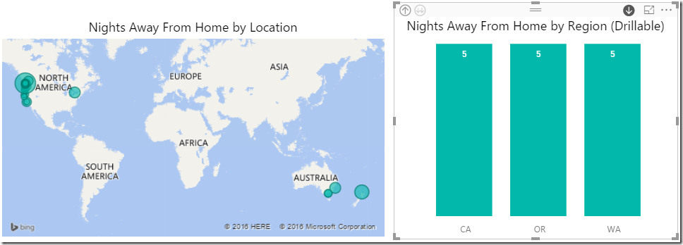
- Title Text: Nights Away From Home by Region (Drillable)
- Font Color: Black
- Alignment: Centre
- Text Size: 12
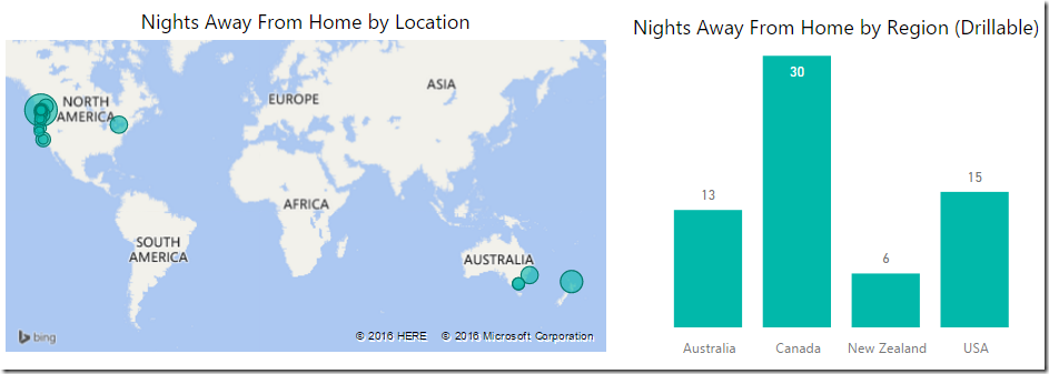
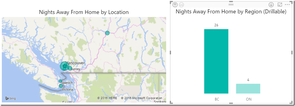
So when all is complete, it looks like this:
To me that is much cleaner.
(Note that according to my wireframe, the column chart will live under the map. I’m only leaving it next to the map for now to make better use of space in the blog post.)
Power BI Visuals – A Drillable Column Chart
So the column chart is cool and all, but I wanted to be able to use it to drill down into a finer level of detail, like Province/State. Unfortunately just typing that in the title won’t do it, we need to make a change.
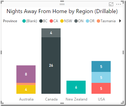
So far everything I’ve built has just worked nicely. I’ve been able to single click everything, and it’s just gone right into the correct place. But when I click the Province field in the Fields pane, I get this disaster:
This plainly is not what I want!
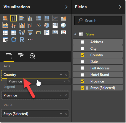
The issue here is that Power BI Desktop makes the assumption that the Province field should move to the Legend. We need to move it to slide into the Axis, just below country. As you drag it, you’ll see a solid yellow line snap in just under the Country field:
And when you let it go, your chart looks like it’s reverted to what you had before.. but there is a difference. Near the top of the chart, we see a few new icons:
And here’s what they do:
- The first (currently shaded) icon is “drill out” to go back up one level. (It’s shaded, as I’m at the top level)
- The second (with the double down arrows) drills in to the maximum level. This would show nonsense data for me, as it shows every Province/State in all countries, without their parent country.
- The third icon (single down arrow) is a toggle to turn on/off drill down mode. It’s a bit awkward, as you’ll see, but is very effective for my purposes.
- The funky little square near the end just sends your chart into full screen mode.
So let’s take a look at my USA stays.
We’ve already seen above what happens if I click the bar for USA; it filters both the map and the chart. So let’s drill in. I click the single down arrow on the right, then click USA. My data re-plots as shown below, and the single down arrow turns black to show it is in drill down mode:
So this tells me that so far I’ve spent the same amount of nights in California, Oregon and Washington. (That was actually a surprise, but fair enough.) What’s odd to me here though, is that it removes all filters from the map. I personally don’t think that this should be the case if I’ve selected something then click the drill in arrow.
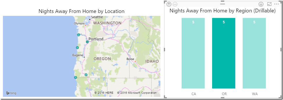
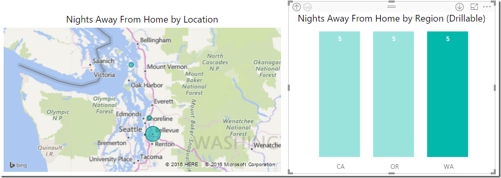
So now I want to drill in to just Oregon. So I click the OR bar, and nothing happens. And this is exactly what I meant when I said it’s a bit awkward. If you had more levels below this (maybe a city field), you’d drill in there. If you want to filter the chart to just Oregon, you need to click the down arrow again to clear drill down mode, so that you can go back into filter mode.
So after clicking the black arrow, we can then select the Oregon bar:
Or Washington:
To get back to BC, I need to drill up to get back to my Country selection. I can do that by clicking the up arrow in the top left. That will take me back to the Country choice.
Now, based on what I’ve said earlier, you’d expect that you would need to do the following to drill into BC:
- Click the Drill Down arrow
- Click on Canada
- Click the Drill Down arrow again to clear it
- Click BC
And that’s EXACTLY what you’d have to do if you were using a touch screen to consume your dashboard. For PC users (which you probably are as the author), you also have this option.
From the Country view
- Leave the Drill Down arrow un-selected
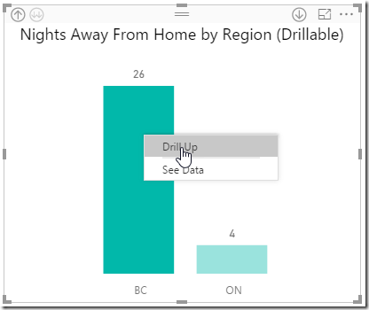
- Right click the Canada bar –> Drill Down
- Left click BC
And it works the same as the touch version with 2 less clicks:
For the record, Drill Up works the same way when you are in a drill down level, as you can see here:
Final Thoughts
At this point, I’m going to slide the column chart down under my map, as per my original wire frame.
I should probably also mention here that you’re not stuck to only one level of drill down. If your data is properly hierarchical and has multiple levels, add them to the axis. It can make for a pretty powerful experience when a user is able to keep drilling in.
My only complaint with this feature is really around the un-filtering of other visuals in the report when I drill in. Personally, I think the other visuals should be filtered to that level. (I.e. if I drill in to USA, I shouldn’t be seeing Australian cities in my map until I click a State name.)
Next Post
The next post - Building Power BI Card Visuals - will focus on building the cards, as well as the final chart.




8 thoughts on “Creating Power BI Visuals”
This is a great tutorial. I think there is a book in the making for mastering visuals as a topic in its own right, I.e. not just selecting and building them but choosing the right visual to get your message across. Keen to know how you've got up to speed so quickly Ken because the dashboard you showed me was highly impressive
My two most important ingredients for success are... trial and error. :p
Darn. I was only working with the 'error' part.
I'd settle for trial and error any day over brain ache, VBA and loads of pain killers!
Pingback: Get Data From OneDrive for Business - Excelguru
Pingback: Creating Power BI Card Visuals - Excelguru
Pingback: Sharing Power BI Reports (for External Users) - Excelguru
Pingback: Sharing Power BI Dashboards - Excelguru