Recently I received a question on how to Unfill in Power Query. In other words, we want the opposite of the Fill feature, which fills data into blank cells (cells that contain a null value.) If we see repeating values, we’d like to keep only the first, then replace all subsequent duplicate values with the null keyword.
Now I’ll be honest that I’d typically never do this. I’d load the values into a table, then use a PivotTable to show the data the way I want to see it:
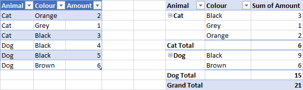
But having said this, if you need to have your data look like this…

... as you do to build dual-category axis charts (as my friend Jon Peltier points out below)... how do you make it happen?
Unfill data with Power Query – Step 1
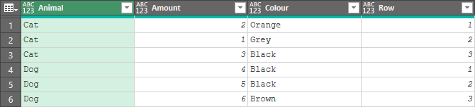
The first thing we need to do is run our recipe for numbering grouped rows. (You can find this in our Power Query Recipe Cards, or in our Power Query Academy videos.)
Namely, it looks like this:
- Sort the data by Animal to order it
- Group the data by Animal
- Add a single aggregation called “Data” for All Rows
- Go to Add Column -> Custom Column and use the following formula
- =Table.AddIndexColumn([Data],"Row",1,1)
- Right click the “Custom” column -> Remove Other Columns
- Expand all columns from the Custom Column
You’ve now got your rows numbered:
Unfill data with Power Query – Step 2
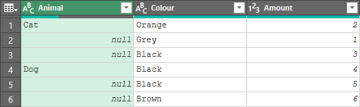
Once you’re in this state, it actually becomes pretty easy:
- Go to Add Column -> Custom Column and use the following formula
- = if [Row] = 1 then [Animal] else null
- Remove the [Animal] column and the [Row] columns
- Re-order the columns as desired
- Rename [Custom] to Animal
- Set the data types
Once done, you’ll notice that we have unfilled the data nicely.
Final Thoughts
As I mentioned at the outset, this isn’t something I ever anticipate myself doing. But if you do have a good business use case, I’d be curious to know what it is. (I assume the asker did – although it came from a comment on an old blog post, so haven’t been able to ask.) Please share in the comments. ?
20 thoughts on “Unfill in Power Query”
Hi Ken,
Thank you so much. That was immensely helpful.
We are doing accounts reconciliation. We have to merge data from multiple tables, each will be downloaded on a daily basis. there are days where we have more than 1 occurrence each. I have been trying to solve this issue since November 2019.
I can send you the file if you would like to have a look at why we need to do the above.
Thanks again. You really are awesome!
Most of there problems (current vs next row) can be done by adding two index columns, one starting with 0, second with 1.
Then you can merging the same table on these columns and compare rows for conditions.
let
Source = Excel.CurrentWorkbook(){[Name="D"]}[Content],
mGroup = Table.Group(Source, {"Animal"}, {{"GRP", each Table.AddIndexColumn(_,"Row",1,1)}}),
mXpandGrp = Table.ExpandTableColumn(mGroup, "GRP", {"Color", "Amount", "Row"}),
mReplaceVal = Table.ReplaceValue(mXpandGrp,each [Animal],each if [Row] = 1 then [Animal] else null,Replacer.ReplaceValue,{"Animal"}),
mRemCols = Table.RemoveColumns(mReplaceVal,{"Row"})
in
mRemCols
Pingback: AWESOME resource for Power BI themes and much more... (Roundup | January 20, 2020) | Guy in a Cube
Pingback: AWESOME resource for Power BI themes and much more... (Roundup | January 20, 2020) - Learn Power BI
Back when I learned to program (Cobol) we called them "Control Break Reports". It was a bother to learn all of the specifics needed to make them work properly, especially when you had more than one control break (group) level.
.
Another term that it would be useful to associate with this article is "UnPivot". Since that is what we normally would do in PowerQuery if we were given this sort of report as input to be used in a Pivot Table.
.
You don't know why someone would want to do this in PQ... I have a couple of speculations:
.
Could be because they are not aware (enough) of pivot tables. As you mention, this is a natural output from a PivotTable. So the person asking for help is trying to do it "the hard way" because he is not aware there is a much easier, "better" way of doing it, in a PivotTable.
.
Or, he could be in the position of working for an unreasonable manager/client who absolutely insists that the new report look EXACTLY LIKE the old one (ie created in COBOL). Someone who is not willing to accept the minor differences in the look of a PivotTable. Been there, done that ...
PS: In your example PivotTable you could also remove the animal subtotals, and even column grand totals to make the pivot table visually identical to the "unfill" report.
I think each user has a different use case for this kind of thing. The original poster sent me their workbook and - at the end of the day - they were able to satisfy their requirements using this approach. I may have done it differently, but hey... we get paid for results. 🙂
Appreciate the Cobol info. Nothing like putting in extra effort in modern tools to generate antiquated output formats. LOL!
When the user is asking how to make a bad dataset from a good dataset, there are always two main reason for this:
1. Lack of knowledge
2. The need to prepare data for the system that requires bad data structure.
I personally would do it with a pivot table
Pingback: AWESOME resource for Power BI themes and much more… (Roundup | January 20, 2020) – Datalytical
Uploading invoice data into Quickbooks requires new header data in the first line of each (parent) invoice, but blank cells for rows that belong to the same invoice and have item (child) data in other columns. i.e. first 4 columns are invoice header data, next 6 columns are invoice detail data. This lets you create that input from a shopify sales report output. This can then be loaded directly into Quickbooks without copying/pasting into a new file.
This is very helpful Ken. My users need to be able to create report to fit within a word processing program file. A pivot table would solve the problem if formatting and copying/pasting into the word processor did not matter. This solution allows us to product a report - looking exactly as the client requested, and allowing more control over formatting etc. The data is all text, so there are no values to aggregate.
The PQ solution also allows us to update the report quickly.
Awesome, love to hear that!
Mark Proctor used an M function in https://exceloffthegrid.com/power-query-chart-data/
The use case is to have the data range that generates a multi-tiered category axis, as in https://peltiertech.com/chart-with-a-dual-category-axis/
One caveat I will throw out here... when I perf tested on 1,000 rows of data, my UI version ran in 0.13 seconds on average. Mark's version took 6.10 seconds on average.
Thanks for this. I wanted to create a monthly birthday/age report for my very large extended family. I couldn't figure out how to print the Month name only once. I am just learning PQ and your solution worked perfectly.
Glad you found it useful!
Thanks so much for sharing this detailed tutorial. I was watching the YouTube video, but got stuck on the "Index". My attempt was by adding an Index, rather than a custom column WITH a formula like you did. Thanks for having this tutorial that SHOWED the foruma I got stuck on. This was exactly what I needed to accomplish.